
Why the Federal Government’s story about NDIS funding differences doesn’t add up

Before we get started we want to let you know – this is a bit of a long read, so now would be a good excuse to get settled with a cuppa.
Or skip towards the end for a very quick summary.
First – a message for the government and NDIA
Thank you for taking independent assessments off the table.
Thank you for promising to be more clear and transparent.
And thank you for promising to take action to rebuild trust.
People with disability, families and our advocacy and representative organisations have experienced inexcusable levels of distress since the plan for independent assessments were announced 12 months ago.
So it will take genuine, meaningful, long and hard work to rebuild the broken trust.
Trust
We can’t rebuild that trust based on what the Federal Government says the problems are. Like the suggestion that wealthier people from wealthier cities are getting a better deal on funding than poorer people who live in poorer areas. Or that functionality is decreasing over time.
So before anything else we need to all agree on what the problems are, together. People who use the NDIS know all too well what the problems are. And they have the best ideas on how to make it work.
If there are things we don’t know about – like cost pressures – we need the government to come clean. We need time, access and independent evaluation on all of the raw information that is causing concern.
No one cares more about the sustainability of the NDIS than the people who need it.
But before we jump into the detail…
Why do we want the data?
Why do we want the financial data and the assumptions and modelling behind it?
It forms the basis of all of the government’s arguments for changes to the NDIS.
Both the previous and current NDIS Ministers have been running a scare campaign on NDIS “cost blowouts” in order to get support for proposed changes to the NDIS legislation.
And while independent assessments are “dead”– we know that’s not the end of the story.
Minister for the NDIS Linda Reynolds is still working to get changes to the NDIS made into law. The Department of Social Services website was updated recently to say, “Public consultations on draft amendments to legislation are expected to occur from late August 2021 ahead of introduction to Parliament in October 2021.”
And over the last week or so, the Minister has continued on with the story started in March by our previous NDIS Minister Stuart Robert, who at the time told ABC radio, “If you live in the seat of Clark in Hobart, your average plan is $105,000. But, if you live in the seat of Franklin it’s $68,000. There’s a 53 per cent difference. Right now in Tasmania, your postcode determines your package and that’s not right.”
Until very recently, the Minister and the NDIA would not share any of the data behind their many similar claims.
Two new documents have been released
The first is a letter from Minister Reynolds to the Joint Standing Committee on the NDIS in response to questions from the Chair, Kevin Andrews MP. It is made up of around one hundred pages of spreadsheets – stuck in a PDF. Not designed for easy analysis…
It is not exactly what the Joint Standing Committee had been asking for. But it is a start.
For months now they along with many others – including the state and territory Disability Ministers – have been asking for full copies of the NDIS Annual Financial Sustainability Reports, and the assumptions and modelling behind it – going right back to the beginning of the scheme.
The second document to come out last week was the latest NDIA Quarterly Report.
In Minister Reynolds’ media release she said, “Issues identified in this report include inconsistent access and planning decisions and inequalities in packages based on socio-economic status. In an insurance scheme, where you live or your socioeconomic circumstances should not matter.”
We agree – but is that what the data really says?
Why the ‘mean’ averages are bad
The data provided shows the average plan funding people have been approved to use.
It is divided up into electorates or postcodes.
The first problem with the data is the way the government have chosen to explain who gets how much NDIS plan funding – by using mean to work out averages.
So what does mean mean here?
In mathematics there are two common ways to find an average number from a list of different numbers. ‘Mean’ or ‘median’.
Mean is when you add up the total plan funding for a particular number of participants – then divide the sum (total) by the number of participants in that list.
Median is when you list all of the plan funding amounts in the list in order from smallest to largest or vice versa – and then work out what the middle number would be.
Mean is the method the NDIA and Federal Government have been using to describe averages. But it doesn’t tell a reliable story.
| Total allocated funding | |
| Person 1 | $5,000 |
| Person 2 | $10,000 |
| Person 3 | $15,000 |
| Person 4 | $20,000 |
| Person 5 | $30,000 |
| Person 6 | $40,000 |
| Person 7 | $50,000 |
| Person 8 | $100,000 |
| Person 9 | $200,000 |
| Person 10 | $1,000,000 |
| Sum (total) | $1,470,000 |
| Mean | $147,000 |
| Median | $35,000 |
In the fictional example above – the Minister could say people with disability in this group get an average of $147,000 plan funding. But when you can see the individual amounts, it’s clear that the majority of people get much smaller plans. 80% of the people with disability on the list got less than $147,000 in their plan.
Big differences in plan funding amounts are exactly what we would expect from an individual scheme for people with an enormous variety of different support needs. That’s just one of the reasons everyone was so outraged at the idea of the 400 ‘personas’.
Using the median to work out the average would present a much more accurate average in the example – at $35,000. Which is pretty close to the actual national median:
- The mean national plan funding size in the recent data is $70,200.
- The median national plan funding size in the recent data is $31,700.
Allocation (how much you get) and utilisation (how much you use)
The data above only shows how much funding is allocated to a person’s plan. Allocation is the total plan funding amount you get. It is how much you could – in theory – use, if everything you needed was available when and where you need it, and everything was running smoothly.
But we know there is a huge difference between how much funding people get versus how much they actually spend. How much you actually spend is called utilisation in NDIS-speak.
So even though the NDIA need to budget for plan allocation – the reality is that most people don’t ever spend more than 75% of their funds – and the data we’ve looked at shows that people who don’t get Supported Independent Living (SIL) use much much less again.
We do know that the longer people have been in the scheme the better they get at spending their funds. There are many good reasons for that – like finally getting off very long waiting lists, finding the things you need, getting more confident, figuring things out…and so on.
Utilisation increasing over time is not cause for concern – it’s cause for celebration. It means people are getting more of what they need instead of just scraping by on the bare minimum.
So when the government talk about costs rising – keep this in mind. It could also mean that the NDIS is starting to work as it should for more people.
The largest plans are not with the wealthiest people in the wealthiest cities
Despite what the Ministers have been saying over the last 6 months.
The federal electorates in red below are home of the 10 biggest average plan sizes across Australia. Starting with the Northern Territory.
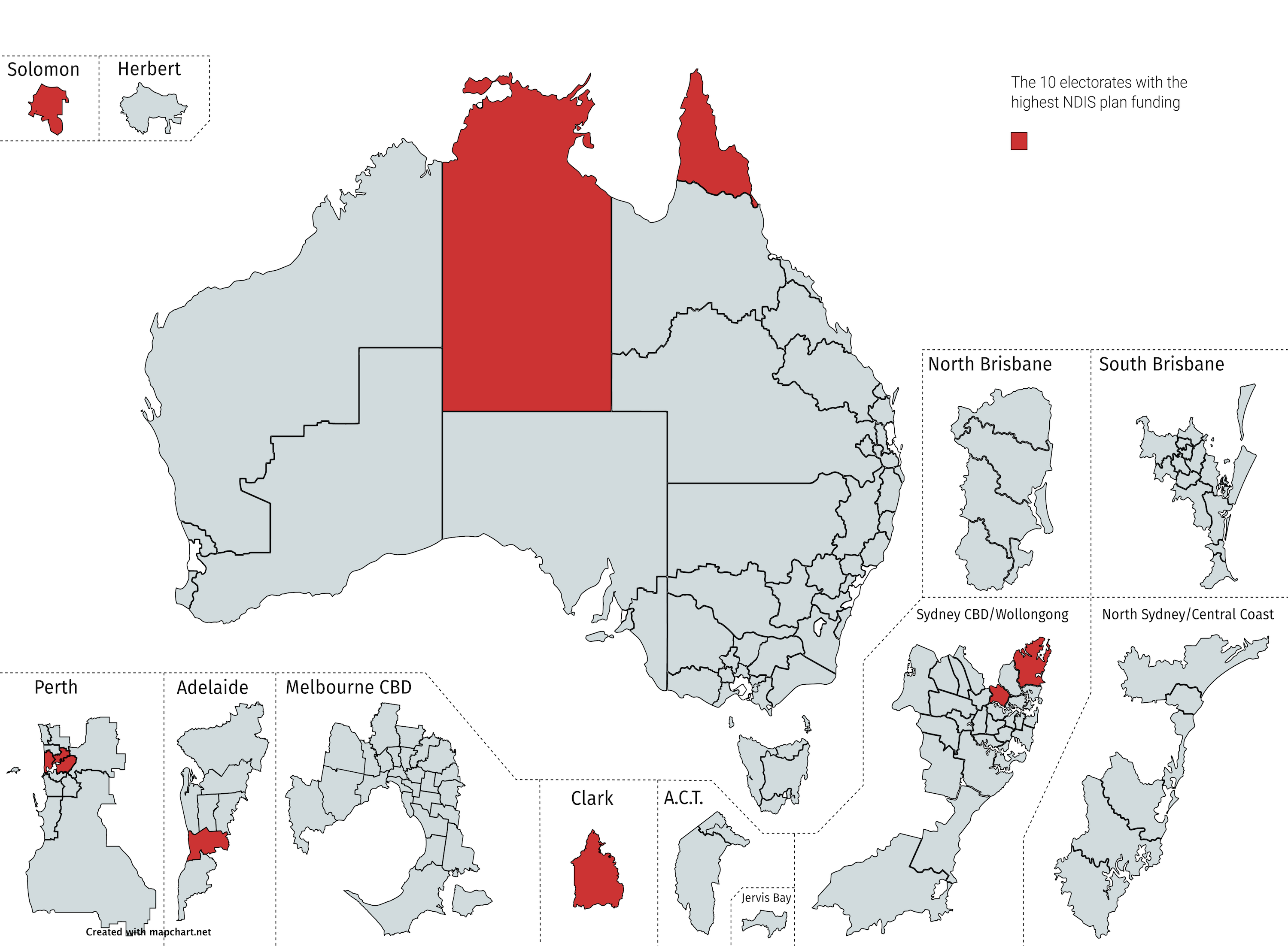
| Federal electorate | Mean plan size | Mean spend (utilisation) | Median plan size | Median spend (utilisation) |
| Lingiari (NT) | $139,200 | $106,900 | $64,884 | $26,184 |
| Solomon (NT) | $114,100 | $98,300 | $34,261 | $24,708 |
| Clark (Tas) | $102,800 | $84,200 | $40,270 | $21,452 |
| Bennelong (NSW) | $98,100 | $83,500 | $39,073 | $35,905 |
| Perth (WA) | $97,100 | $73,300 | $45,879 | $22,090 |
| Boothby (SA) | $93,700 | $78,000 | $41,762 | $20,601 |
| Mackellar (NSW) | $92,900 | $77,100 | $36,707 | $24,648 |
| Swan (WA) | $92,400 | $65,100 | $44,901 | $20,159 |
| Leichhardt (Qld) | $91,900 | $67,700 | $44,461 | $19,303 |
| Curtin (WA) | $90,000 | $61,200 | $49,355 | $20,540 |
So if we want to talk averages – people in the Northern Territory are getting plans worth around $120,000 (on average), but only spending 20% of that – or about $25,000.
That looks like a big problem.
And Victoria doesn’t even make it into the top 10, despite being home to many more wealthy people and cities than the Northern Territory.
As you can see – the utilisation is just a tiny fraction of what’s in the plan.
The largest average plans exist where there are lots of people who use SIL
A clear pattern begins to emerge when you compare the largest and smallest plan sizes. Here’s some of the data from Victoria.
| Victorian electorate | NDIS particpants with SIL | Mean plan size | Median plan size | Median spend (utilisation) | NDIS participants in the area |
| Largest 3 | |||||
| Chisholm | 10.5% | $88,890 | $64,884 | $26,184 | 2,827 |
| Goldstein | 8.7% | $75,100 | $36,424 | $19,507 | 1,797 |
| Kooyong | 9.4% | $67,000 | $40,645 | $19,615 | 1,744 |
| Smallest 3 | |||||
| Lalor | 1.3% | $51,800 | $24,839 | $13,146 | 3,341 |
| Calwell | 0.9% | $52,200 | $25,093 | $15,845 | 4,187 |
| McEwan | 0.9% | $44,400 | $20,327 | $10,858 | 4,311 |
What changes in the top three versus bottom three electorates?
Two things:
- The number of NDIS participants in each area, and
- The percentage of people who are funded for Supported Independent Living (SIL).
People who live in group homes generally need more support – and that’s not a problem
People who have SIL funding in their plans are much more likely than any other group to use most of their funding – the majority of it is allocated to the SIL provider, and the SIL provider uses it or loses it. (They try not to lose it).
People who need SIL also tend to have some of the highest support needs of all people with disability using the NDIS. Primarily, they are people with intellectual disability and autistic people who live in group homes.
Some participants get more than others. Obviously. But it’s not because they are better self-advocates, or have more resources. It appears to be because the people who get more need more.
What is the government’s solution to that – now that independent assessments are done and dusted? Cut funding from those who need the most support? Cut funding from those who live in the cities?
That is not the NDIS we signed up for.
In summary
At first glance, we can see how it could look as though the funding levels in Victoria roughly reflect the socio-economic status of people who live in those areas.
But that is largely a result of how the data is presented, using mean averages instead of median – and dividing participants up into geographical areas.
What the data really says is the more people with very high support needs in any given area, the more likely they are to get more funding. And if a big chunk of that funding is for SIL it is more likely to be used.
Using the funding you have been allocated to access the supports and services you need is the entire purpose of the NDIS.
What’s next?
We know you are all tired. Exhausted. Over it.
We know you are all worried about COVID, and the vaccines, and the lockdowns.
And we know you are all worried about what the Federal Government will do to the NDIS next.
We are too.
But we want you to know that we are here for you. We are keeping a very close eye on everything. And we are ready to take action as soon as we need to.
As for right now – we want you to take good care of yourselves. It has been a relentlessly worrying and uncertain time for far too long.
All we want to ask of you is to take time out for self-care, frequently. Do some easy and relaxing things to take good care of yourselves. You might like to watch a movie, listen to music, read a book or magazine, chat with loved ones, get cosy on the couch, eat something yummy, get crafty, or find someone safe to talk to. We want you all to be safe and well.
We will let you know when we need your help to win the next battle.
Until then, we’ll be here holding the fort. x
If you’d like to read more
This is not a formal economic analysis – just a little introduction to some of the issues. If you would like to get more information from the sources you might find some of these links helpful:
NDIS Quarterly Report: 2020-21 Q4
Media release – Minister Reynolds 9 August 2021
Disability Reform Ministers’ Meetings Communiqué 9 July 2021
Disability Reform Ministers’ Meetings Communiqué 13 August 2021
NDIS Legislative Reforms: Timetable for legislation – Department of Social Services
Brutal cuts to NDIS see some plans halved without consultation – The Saturday Paper
Join the conversation